Victory / Brand strategy & identity
Rebrand the product to rebrand the customer.
A brand associated with what someone was fighting needed to become a symbol of who they were becoming.
Creative direction · Brand strategy · Identity systems · Product architecture

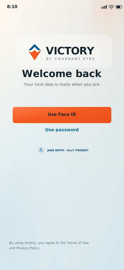

01 The strategic turn
Change what the
product stands for.
The rebrand began with the relationship the product was creating, not the mark it was wearing.
The category frame
What is wrong
with me?
Fear of exposure. Control of behavior. A product the customer can’t wait to quit.
The Victory proposition
Who am I
becoming?
Responsibility. Support. A daily practice the customer can choose to stand for.
02 The Reforging Road
Victory is
in the continuing.
Forward is victory. Staying with the work is victory. Returning after a setback is victory.
The next step is small enough to take today, and it is the person’s to take.
Brand strategy, not clinical guidance. Nothing here promises recovery.
03 The Beatitudinal Journey
A reason to choose,
rooted in faith.
Behavioral science stayed at the foundation; faith became the multiplier. For Christian customers, faith is central to who they want to become, and making it central to Victory gave them a reason to choose.
God transforms. The customer walks. Victory guides.
A brand-narrative reading of Matthew 5:3–10. The topic names are labels, not Scripture quotations.
04 Roles and architecture
Give every part
a clear job.
The human roles
-
The customer
Pilgrim
The person walking. They choose the next step; nothing here chooses it for them.
-
The brand
Seasoned Guide
Experienced, unshockable, already down the road. It offers orientation, not judgement.
-
The Ally
Companion and witness
Another person, walking the same direction, close enough to notice. Not a monitor.
-
The product
A toolset
It supplies light, structure and a way back. It cannot do the changing.
-
The Road
Formation
The practice itself: forward, staying with it, and returning after a setback.
The two products


The proposed portfolio
-
Covenant Eyes
Institutional authority
The organisation behind the promise, and the source of trust the products borrow.
-
Victory
The customer relationship
The formation experience: the road, the Guide, the Ally, the Waymarks.
-
Victory Shield
Device protection and Screen Accountability
The supporting utility, named so that it reads as part of the family and not as the brand itself.
-
5 Stones
The church channel
The route to congregations, addressed to leaders rather than to the individual on the road.
The architecture as proposed, not a description of what shipped. The architecture record
05 Strategy into decisions
Make the argument
usable.
Three working books gave the organisation a shared basis for decisions about naming, language, design and product.
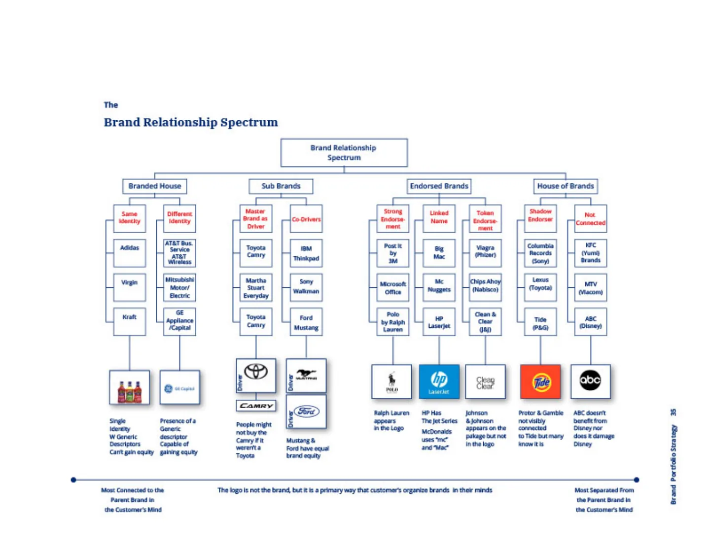
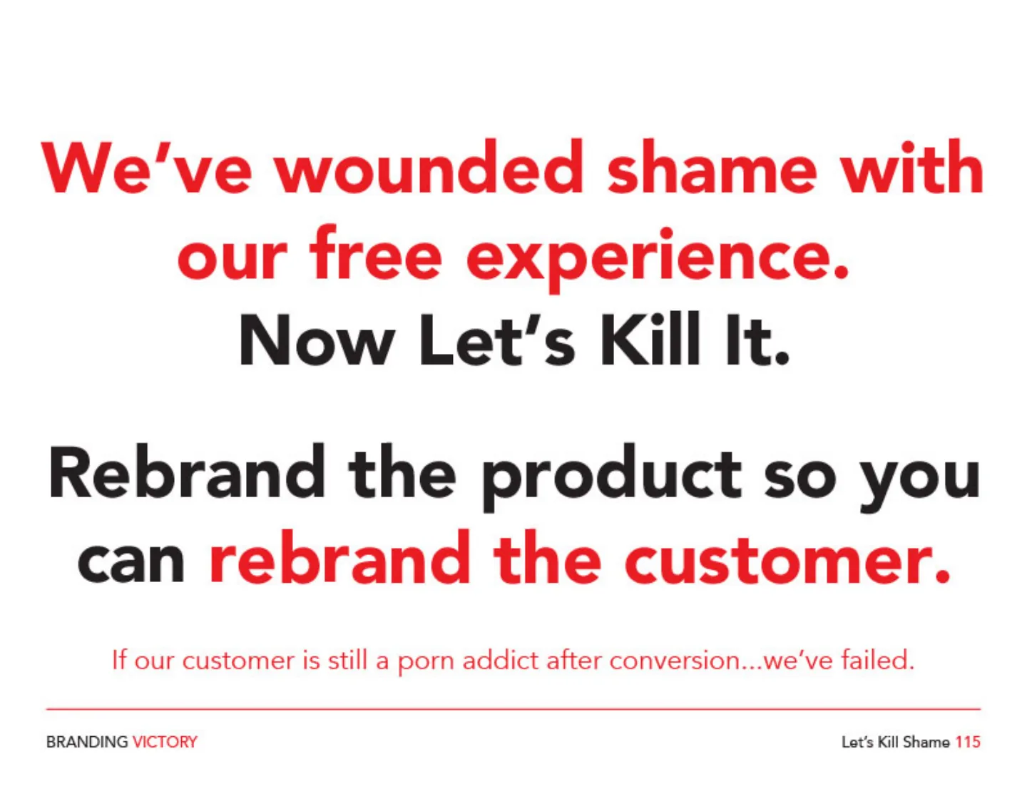
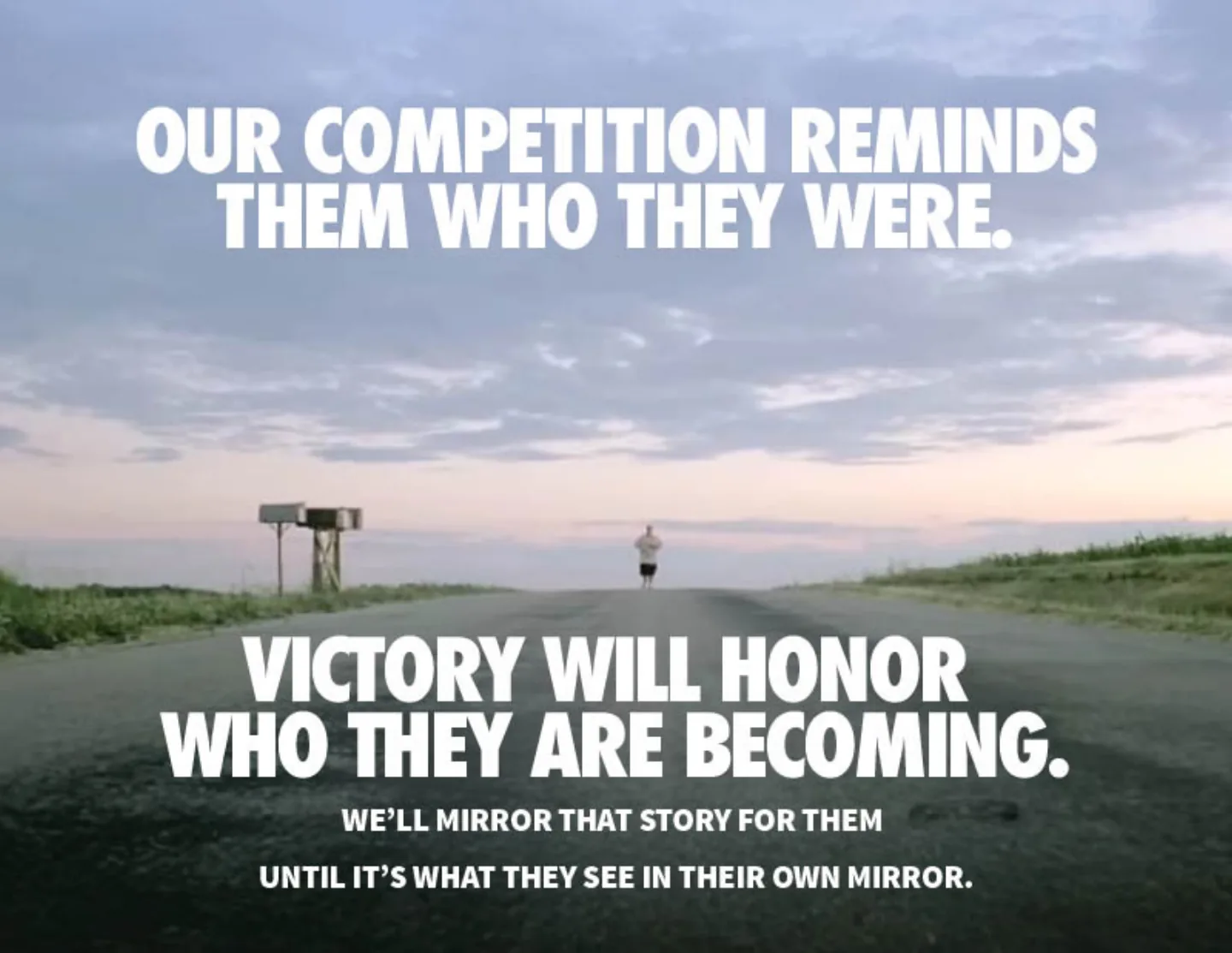
Working books by Jason Walker for Covenant Eyes, shown as made. The process record
06 The consequence
The story became
a design rule.
Agency, relationship and return, each carried by a control.
-
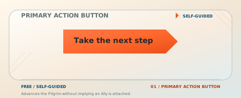
Agency
A next step you can decline.
One step, no streak to protect, no consequence for not pressing it today.
-
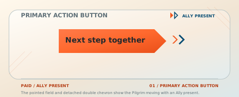
Relationship
A companion, in the form itself.
The Ally variant adds a detached double chevron: someone else moving the same way, alongside.
-
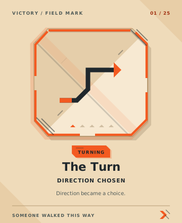
Return
Ground you crossed stays crossed.
A Waymark, once earned, remains after a setback. The way back is a next step, not a reset.
Verified: authored strategy, a coordinated identity and a repeatable product grammar. Not claimed: retention, commercial or clinical outcomes.
Identity · one story, made tangible
A symbol of who
you are becoming.
The strategy, visible in every choice: the mark, the color, the type, the motif, the voice, the interface.
01 Logo family
One family.
Two distinct jobs.
Victory carries the relationship. Victory Shield carries protection and Screen Accountability.
Victory
The compass leads and the wordmark follows: direction before name.
Victory Shield
The same compass held inside a shield: a different job, not a different brand.
Four treatments, both products
-
Victory
-
Victory Shield
Eight approved masters. Negative artwork is drawn for a dark ground, so each plate carries the ground it was made for.
02 Color
The palette holds.
The relationship changes.
One composition, one set of words, four approved relationships.
Member communication
This isn’t a short fight.
It doesn’t end in a month. If you’re going to walk this road, you’ll need something that stays with you.
Upgrade to Lifetime
- MonochromaticQuiet Authority
- AnalogousGuided Movement
- ComplementaryClear Contrast
- Split complementaryControlled Energy
The artifact keeps its own ground in either environment; approved artwork is never recolored. The governed palette, with allocations
03 Type + icon
A word and a symbol.
The same character.
Icons share the type’s character, so an action looks like it belongs to the sentence beside it.
Public Sans O
The rule the letter supplies
- Open counter, kept
- Even stroke, kept
- Flat terminal, kept
- 24-unit grid, kept
Search icon
In use, at 24px
The library, at the size it has to work
Fifty of the one hundred Public Sans icons, at the sizes they have to work. The full library, in the icon project
04 Motif
One grammar.
120 ways to speak.
A 16 × 16 field, three edge directions, one vocabulary a team can use.
Thirteen constructions, drawn on the field
The thirteen constructions the grammar is built from. All 120 motifs, in the Studio atlas
05 Composition
The system composes.
Voice, color, typography, motif and photograph meet in one artifact.
Five approved posts, reconstructed from the source artwork and the governed rules. The Studio
06 Photography
The road ahead.
Someone beside you.
A conversation, a difficult stretch, a return to the trail.
Authored imagery for the Reforging Road.
Source and provenance
Generated editorial scenes made for this design direction. They are authored images, not customer records or testimonials, and no person shown is a Covenant Eyes customer. Native color is kept in both environments. The photography direction
07 Voice
Meet the moment.
Make the next step clear.
The writer supplies the insight. The principles shape the voice. A person makes the final call.
Historical Lifetime email
“At midnight tonight, our Lifetime Membership price increases by $100.”
Kept
The midnight cutoff and the $100 increase, exactly as the offer stated them.
Removed
“Tonight” and the possessive “our”, so the line states the fact instead of pressing it.
A historical email, not a live offer. The Brand Voice case
The instrument, on the approved corpus
Email · Lifetime deadline · principles applied
At midnight, the Lifetime price goes up $100. The deadline remains. The pressure leaves.
The full Email, Blog and Social records, with every edit and the reason for it, need JavaScript. Read them in the Brand Voice case
08 Interface
One intention.
Two environments.
The same screen at the same scale in both environments.
The screens, the components and the Waymarks: one showcase
Eleven screens, fifty components in each tier and twenty-five Waymarks, each on the ground its artwork was drawn for.
In concert
One story.
Every choice reinforces it.
One artifact with every system switched on.
Victory / One honest step
Keep moving toward who you can become.
Choose the next step. Keep good company.
Continue together
Type
Wisdom + clarity
Source Serif 4 carries the voice.
Public Sans brings clarity.Color
A tone with purpose
Warm action.
Clear orientation.Motif
Direction + relation
A next step, paired
with a companion.
The full record remains at the Journey Brand System and the original case study.
Loading the Brand Voice case study…
The Brand Voice case study could not be embedded here. Open it in a full page instead.