Components and tokens
One set of parts. Every surface.
The reusable pieces behind the school page, the product story and the campaign compositions. Each example below is the real component, with its source copied from the example itself so the two cannot drift.
Type. The observed Coram typeface is TT Commons Classic. It is named first in the stack and renders where it is licensed and installed. No font binary ships with this study; where it is absent the system sans stands in, and that is recorded in the build notes rather than claimed as an exact match.
Figma. No native Figma file was created in this pass; no Figma connection was available in the build environment. The implementation specification at the end of this page describes the variables, text styles, components and variants to build there, one to one with these tokens.
Colour
Green, charcoal, white, and a pale neutral for reading.
Green #039179 and charcoal #1F1F1D are observed website values, provisional until Coram’s own rules are available. Two greens are declared on purpose: the recognition green for marks, rules, fields and large type, and a working green for small interactive text and button fills, where white type reaches 5.3:1. Warning colours are reserved for real semantic states and always travel with a written label.
Contrast measured as WCAG 2 ratios. Reading text uses ink, ink 2 or ink 3 on white, paper or the green field. The recognition green is never used for text below 24px.
Type
Large, deliberate, and left to breathe.
One family, two weights: Medium for display and structure, Regular for reading. Hierarchy comes from scale and space. Display type is tracked slightly tight; reading type is not tracked at all. Numbers in frames, events and records are tabular.
Ordinary takes a lot.
For the people who look after a school.
A drill notice reaches the designated team.
A school day depends on people who notice, prepare, and respond.
Your team keeps track of a thousand ordinary things. Coram connects video, entry events, and response tools so they can review what matters and decide what comes next.
For schools
Cameras in this drill
Sample time and location. Generated imagery.
Spacing
An 8px scale, a fluid edge, and one section rhythm.
Eight steps from 8 to 128px. The page edge runs from 16px on a phone to 80px on a wide screen. Sections share one vertical rhythm, 56 to 120px, so pages read as one system.
Tokens, as declared
.coram{
  --c-green:#039179; --c-green-ink:#037A66; --c-green-deep:#065F4F;
  --c-green-050:#F1F8F6; --c-green-100:#DDEFE9;
  --c-charcoal:#1F1F1D; --c-ink:#1F1F1D; --c-ink-2:#4A4A46; --c-ink-3:#6B6B66;
  --c-white:#FFFFFF; --c-paper:#F6F5F1; --c-paper-2:#ECEAE4;
  --c-state-warn:#B54708; --c-state-alert:#B42318;
  --c-face:'TT Commons Classic','TT Commons',system-ui,-apple-system,'Helvetica Neue',Helvetica,Arial,sans-serif;
  --c-display:clamp(40px,6.4vw,104px); --c-h2:clamp(30px,3.8vw,60px); --c-h3:clamp(20px,1.9vw,27px);
  --c-lede:clamp(17px,1.4vw,22px); --c-body:clamp(16px,1.15vw,18px); --c-small:14px; --c-label:12px;
  --c-s1:8px; --c-s2:16px; --c-s3:24px; --c-s4:32px; --c-s5:48px; --c-s6:64px; --c-s7:96px; --c-s8:128px;
  --c-edge:clamp(16px,4.4vw,80px); --c-section:clamp(56px,7vw,120px); --c-max:1440px;
}
Wordmark placement
The official file, as supplied, with room around it.
The wordmark is placed from Coram’s supplied file and never redrawn, stretched or recoloured in the letterforms. Clear space on every side is the height of the aperture. Minimum height on screen is 22px. The reversed version for charcoal surfaces is derived from the same file with the aperture untouched; it stands in until Coram’s own reversed artwork is available.


Source
Responsive hero
One idea, large type, a photograph with a hard edge.
Type on the left, photograph bleeding to the right edge on a wide screen; type first and the photograph at full width on a phone. The caption names the photograph honestly. The primary action stays on the page; the secondary action goes to the demo.
For schools
Ordinary takes a lot.
A school day depends on people who notice, prepare, and respond. Coram connects video and response tools to support their next step.

Source
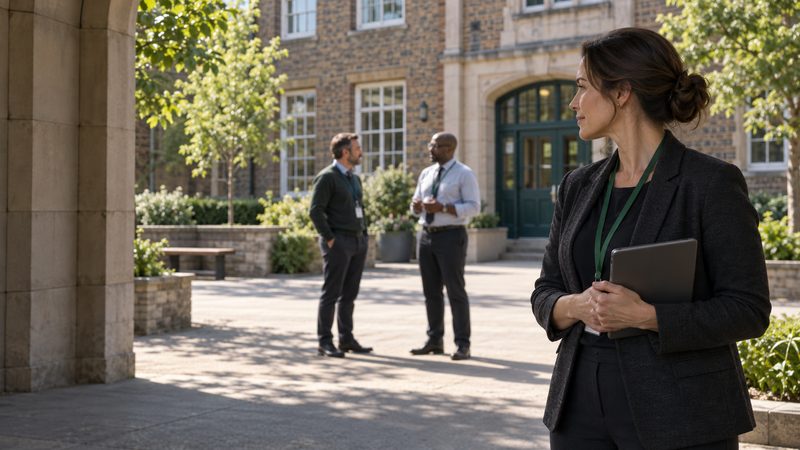
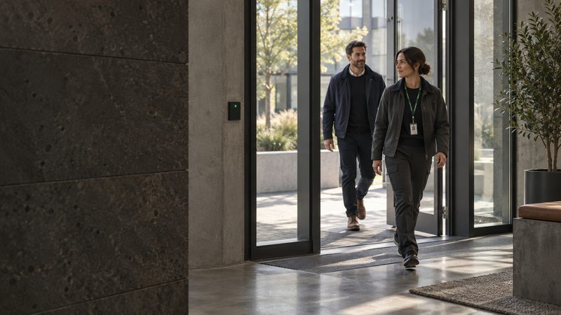
Footage frame
A camera view is always a labelled frame.
Camera and location in the bar, an illustrative time on the right, corner marks on the image, and tags in the foot that say what the frame is. Concept overlays never pretend to be product UI, and a real-time claim is never made.
Source
Event row
One event per line. Time, what, where, state, action.
Tabular numerals keep the time column still. The state is a word with a dot beside it, never a colour alone. On a phone the row stacks under the time.
Source
Evidence reference
A finding points at its evidence.
A thumbnail, the camera, the time, the length, and where the clip sits in the record. Used in the review record and in any report that makes a claim.
Source
Quote and proof module
Customer evidence appears only with attribution.
A paraphrase or an approved quotation, the organisation, and the link to the source. If it cannot be attributed, it does not appear. No generated person is ever presented as a customer.
From a published Coram customer story
Coram’s published Lakepointe Church story describes staff with independent access to footage across several campuses, without waiting on one person to pull it.
Lakepointe Church multi-campus, as published by Coram Read the story on coram.ai
A paraphrase of Coram’s own published account, not a quotation.
Source
CTA
Primary, secondary, quiet, and a text link.
The primary fill is the working green so white type passes 4.5:1. The secondary is a charcoal outline. Quiet is for controls inside components. One clear emphasis per composition; a surface never carries two primaries.
Source
Source, on charcoal
Tags and states
Words first. Colour second.
DRILL is a charcoal tag with a green dot, visible in every stage of a drill. Illustrative marks sample data. Semantic states use warning colours only for real conditions and always carry their word.
Source
Ledger
Product roles as a ledger, not a card grid.
One idea per row. The distinctions a buyer needs, what it requires and what it connects with, read across a line. Used for the four roles on the school page.
04
Emergency managementEmergency Management
Alert designated staff, coordinate the response, practise drills, and support reunification workflows, with a record of what the team did.
RequiresSoftware. It can operate separately or connect with Video Security.
Connects withVideo, for camera context during a response.
Source
Email block
The welcome and preparation email.
A 600px single column. The composition shown is the lifecycle email from the strategy: it asks about the reader’s place and team, and gives one concrete next step. Rebuild with tables for production clients; the layout, copy and hierarchy are here.
Subject A few questions about your school, before we set anything up · Preview Tell us how your team hears a notice today.
Welcome
Before the first setup, tell us about your day.
Thanks for the conversation. Before anyone configures anything, it helps to know how your school runs today. Three questions, and your answers shape what we set up first.
- Which entrances and hallways do your staff watch most closely, and when?
- Who is on the designated team, and how do they hear a notice now?
- When did you last run a drill, and what did the team write down afterwards?
Reply to this email with your answers, or bring them to the demonstration. We will build the first walkthrough around your locations and your roles, not a generic school.
Source
After the drill
A one-page debrief in the team’s own words.
What the team noticed, what helped, what to change, an owner, and a follow-up date. It recognises useful contributions without scores or ranking. Blank, it is a worksheet; filled, it is the last page of the review record.
After the drill
WorksheetIn the team’s words.
Name the people and the steps.
One or two concrete changes.
A role or a name.
Before the next drill.
Source
Ad composition
Campaign compositions built from the same parts.
A 4:5 social composition and a 1200 by 628 landscape, built in HTML so the words, type, geometry and photograph are editable. The same structure carries every concept without becoming a colour-swapped template: the photograph and the line do the differentiating.
For schools
Ordinary takes a lot.
For the people who notice, prepare, and respond.
Access and videoOne badge. Two people.
Connect the door event to the full picture.

Ask a bigger question.
How long did this conveyor run without product yesterday? Investigate the pattern. Review the evidence. Decide what to change.
Explore Deep InvestigationSource
Drill workflow
The four-stage component, rendered from data.
Drop <div data-coram-drill></div> on any page that loads coram.css, coram-drill.css and coram-drill.js. The stages, copy and sample data live in coram-drill.js so the school page, the standalone story and the case study stay identical. Keyboard: the stage buttons, Back and Next are real buttons; focus moves to the stage heading on every change.
Source
<link rel="stylesheet" href="coram.css">
<link rel="stylesheet" href="coram-drill.css">
<div data-coram-drill data-img-base="../../assets/images/work/coram/"></div>
<script src="coram-drill.js" defer></script>
Figma implementation specification
What to build in Figma, one to one with this page.
No native Figma file was created for this study. No Figma connection was available in the build environment, and screenshots are not relabelled as components. The specification below is enough for a designer to build the library in an afternoon; the HTML and CSS on this page are the reference implementation and remain the source of truth for values.
Coram Concept Library, with pages: Tokens, Type, Components, Compositions, Pages. Publish as a team library so the page files consume it.colour with one mode. Variables named exactly as the CSS tokens without the prefix: green, green-ink, green-deep, green-050, green-100, charcoal, ink, ink-2, ink-3, white, paper, paper-2, state-warn, state-alert, night-text (white at 82%), night-faint (white at 58%), rule (charcoal at 14%), rule-2 (charcoal at 30%).space: s1 8 through s8 128, plus edge-phone 16, edge-desktop 80, section-phone 56, section-desktop 120. Auto-layout padding and gaps bind to these, never to typed numbers.Display/Desktop 104/100 Medium, tracking -2.5%; Display/Phone 44/42; H2/Desktop 60/61; H2/Phone 32/33; H3 27/31 and 21/24; Lede 22/32 and 17/25; Body 18/28 and 16/25; Eyebrow 12/14 Medium caps tracking 14%; Label 12/14 Medium caps tracking 12%; Small 14/21; Mono for times, 14/20 with tabular figures on.surface=white | charcoal, size=header 26 | footer 22 | card 18. The reversed variant uses the derived file until Coram supplies its own.kind=primary | secondary | quiet, surface=white | charcoal, state=default | hover | focus | disabled, arrow=true | false. Primary fill green-ink, text white. Secondary 1.5 stroke ink. Focus: 2 stroke ink offset 3.kind=drill | illustrative | outline | state-ok | state-warn | state-alert. Drill carries an 8px green dot before the word.rule. Fixed 76 time column, fill what column, fill where column, 148 state column, hug action. Variants: state=drill | sent | ack | open; layout=desktop | phone where phone stacks what, where and state under the time.rule-2, radius 3. 120 by 68 thumbnail slot, then title (Body 15 Medium) and meta (Small, tabular). Hover stroke ink.green, fill green-050. Slots: label, quotation or paraphrase (25/33), source line (organisation Medium, descriptor, link), note (Small ink-3).ink, head row, then a two-column grid of fields (label Medium caps, value Body 15). Variants: filled=worksheet | record.Ad/Portrait 1080 by 1350 and Ad/Landscape 1200 by 628. Slots: top (wordmark, tag), photo, headline, support, foot. Variants: surface=white | charcoal | green. Type scales with the frame, matching the container-query sizes in CSS.School / Desktop 1440, School / Phone 390, Product story, Components. Build from instances only; detach nothing. Where the CSS and Figma disagree, the CSS on this page wins and Figma is corrected.Exact wordmark geometry, type files and formal rules should come from Coram before any commissioned production. Values here are proposals for this independent study.